How to Design Large Format Trade Show Graphics
Jacob Norris, Guest Post
“Oh my god Becky, look at that large trade show graphic!”
Forgive the Sir Mix-a-Lot reference. I couldn’t resist. But then again, most graphic designers have a good sense of humor, both artistic as well as musical. A good song can inspire and change your design mood, just as seeing work from other designers can give you great ideas.
What we are going to review today is the terribly easy world of large format graphic design for trade show exhibits and other large structures. Now of course, as a graphic designer, you noticed I put the words “terribly easy” into that previous sentence and you instantly think I’m crazy. Most designers rarely design a layout larger than a corporate booklet or perhaps a 20″ x 30″ poster. Therefore, when it comes to knowing the secrets to making a perfect graphic print at 30 ft. wide by 10 ft. tall, designers get cold sweats and think of calling in sick that day.
But fear not. Designing for large format is actually quite simple once you know the basic steps. And, if you do large format designs on a regular basis, you might find that it is more enjoyable than most jobs. All it takes is a leap of faith… and trust in my advice.
Please note this is only a breakdown of the most important elements. Should you need more details, I’m happy to provide further information.
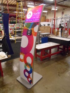
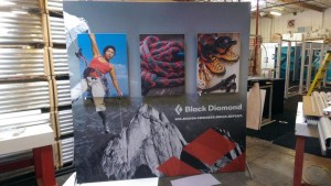
 Tip #1 – Large Format Graphics are Viewed from a Distance
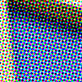
When you look at a billboard along the freeway, you probably wonder how a large graphic can appear so crisp. The beauty of billboard graphics is that, if viewed from 1 ft. away, it would appear like a blotchy and dotted mess. It’s the perceptive ability in our eyes to complete images that makes such items work.
The concept for trade show graphics isn’t that much different. But, luckily, trade show printing is MUCH higher quality than billboards. However, the concept is the same. At a trade show, it is rare for a booth visitor to stand 1 ft. away from a printed graphic that is 30 ft. wide by 10 ft. tall. Though it does happen. A large format trade show graphic must be stunning from the aisle as potential customers pass by. You want to create something unique and eye-catching without worrying about print quality. Should someone stand next to the display, and really want to analyze the quality, they may notice a slight difference from perfect. But that isn’t common.
Tip #2 – Patience and Computer Power
You need to have a powerful computer before you design something in large format. Many of the files you will be processing can be beasts on your RAM and processing speed, not to mention your video card. Therefore, if you feel your system isn’t up to the task, but you have still been given the job of designing something very large, I recommend you be patient. Most modern systems that run graphic design software without crashing on opening will eventually process your requests if you wait. You just have to allow the system to get through all of the math.
 One change you should make to your Adobe software (I’m assuming that is what you are using because hardly anyone uses other graphic design software today) is to alter the scratch disc settings. In Illustrator you will find that under “Preferences” then “Plug-ins & Scratch Disks.” When you find it, be sure to change the “Primary” to STARTUP and the “Secondary” to the largest hard drive on your computer. Usually that is the main drive, but if you have larger drives on your system used for storage, change it to that. In Photoshop, you will find these settings under the “Edit” menu followed by “Preferences” and then the “Scratch Disks” section. Here you may only have one option depending on your system. Specify the main drive as primary start-up disk and then, if you have a secondary, larger drive, used for storage, use that as another. This will actually set the drives to use hard drive space for extra processing during your layout.
Power systems today can use up to 32 GB of RAM and have processing speeds that are out of this world. 64 bit systems are always desired but not always affordable. The more RAM and processing power you have, and the faster video card you have with as much internal RAM as possible, the smoother your experience will be.
But, for many years I have worked on systems well below the standard recommended system for large format design and still accomplished my goals. The word is always patience. You need to allow the system to process.
Tip #3 – Resolution is Different in Large Format Design
Most standard corporate designs, such as business cards, brochures, booklets, and magazines, require you to work at 300 ppi (pixels per inch) or higher. However, for large format design, you do not need that level of resolution. Instead, most large format printers work at anywhere from 100 to 120 ppi maximum. The main rule is to always read the company’s graphic submission requirements so you know what resolution they are looking for. If they state that 100 ppi is the requirement, that means your “raster images” should be 100 ppi at final print size or 100% scale. Knowing this resolution requirement ahead of time will save you many hours of waiting for your computer to process and save a file. Imagine creating a display graphic that is 10 ft. wide by 8 ft tall in Illustrator or Photoshop with a resolution of 300 ppi or higher on raster effects and images! The time it would take (if your computer would even manage it) would be large indeed. And the file size would just be too big.
Large format printing is different from standard offset printing. Dye sublimation, UV wide format inkjet/direct print, and Lambda outputs print excellent quality at lower file resolutions. The brochure image you printed at 300 ppi can print the same quality at 100 ppi on fabric using a dye-sublimation press. It just works.
 Tip #4 – Scaling Items and Viewing at 100% Zoom
At some point in your large format graphic design adventure, you will need to use raster/bitmap photo images in your layouts. Hopefully you have very large, high-resolution images, but how do you really know what will work?
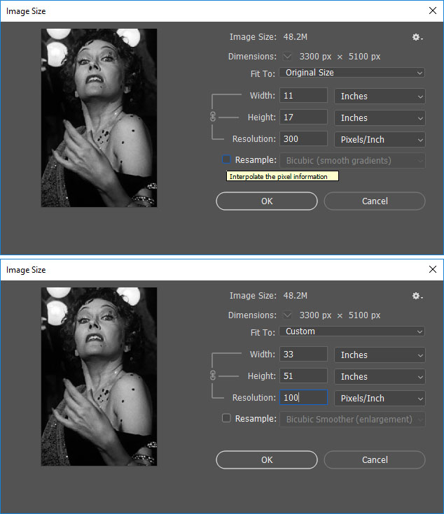
When working with raster images, you should always pre-scale them in Photoshop so you know the “natural size” for all resolutions. For example, if you have a photo that opens in Photoshop and is naturally 11″ wide by 17″ tall at 300 ppi and looks perfect, you should then find out how that image will scale to larger sizes. To do this, go to the “Image” menu in Photoshop when the file is open and select “Image Size.” At that point, look at the dimensions of the file and then “uncheck” the “re-sample” box.
Once that is done, change the width of the image to something higher, like what you actually want it to print at. You will see the resolution drop. Or, alternatively, just change the resolution at that point to the required resolution your printer has asked for. In this case, the 11″ x 17″ image that is 300 ppi, when reduced to 100 ppi, becomes an image that will print to 33″ wide by 51″ tall. Not a bad increase. You can then re-sample the image to larger sizes, but we’ll get into that later.
Getting back to the original 11″ x 17″ image. Before you scale it up, be sure to view the image at 100% zoom on your computer screen (working on desktop systems is recommended as most laptops do not clearly show full quality). Large format printing is exceptionally accurate when it comes to the print quality in real life compared to what you see on your computer screen. Should you see an imperfection on the screen, it will print that way on the final output. It’s always good practice to view all raster images and full layouts at 100% and go through every inch of the design before you send it to a printer. That way, you will know if there is a quality problem.
So that 11″ x 17″ 300 ppi image, when dropped to 100 ppi, will now print at 33″ x 51″. That is an excellent enlargement without altering the file size in any way! But what if you need to make the image larger beyond that?
Tip #5 – How to Force Raster Images to Sizes Larger Than They Support
The latest version of Photoshop has excellent tools for making raster/bitmap images bigger than they naturally are. Older versions of Photoshop can also perform these tasks, but it requires multiple manual steps to accomplish the goal. The latest CC version has most steps built-in to the “Image Size” options.
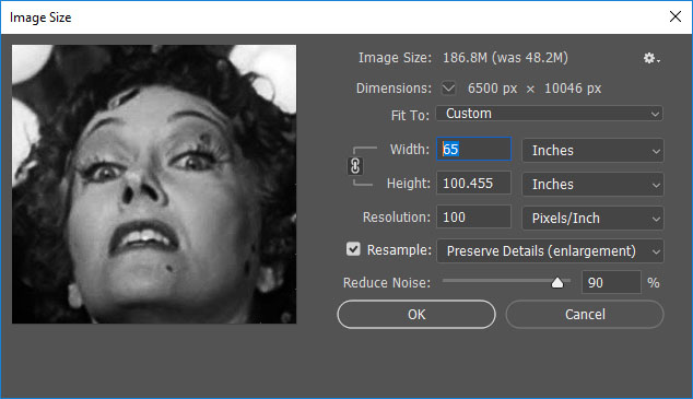 To make our 11″ x 17″ 300 ppi file that has now become 33″ x 51″ when dropped to 100 ppi even bigger, we must force it up. The steps are simple but still require you to view the file at 100% scale afterwards. Begin by turning on the “re-sample” check box again when viewing the file with the “Image Size” window open. Then, look for the “Preserve Details (enlargement)” or “Bi-cubic Smoother (enlargement)” items in the drop-down menu beside the re-sample check box. Here you can play with the options presented in the enlargement as there are various settings to control. But, the basic idea is to choose one and then force the image up to the final print size.
For our example, let’s say we want to go to 65″ wide. With the re-sample check box active, the image will instantly convert to the correct height when you change the “width” to 65. And the print resolution will be maintained. Give it a try to see what happens. When the file has finally processed, you will see a larger image with some slight loss in quality. But, since we are printing in large format, which is usually viewed from several feet away, you shouldn’t have too much of an issue.
On a side note, it is not recommended you increase images beyond 200% in scale, especially if they are already lower quality images. Since you will be viewing the file at 100% scale on your screen and will know what each inch of the image will print at, the decision is up to you. Many raster images behave differently depending on the original quality of the image. I’ve seen some stock images scale up to 400% larger while others only support around 150 to 200%. It comes down to how the image was originally created.
 Tip #6 – Photoshop Noise and Manual Touch Ups
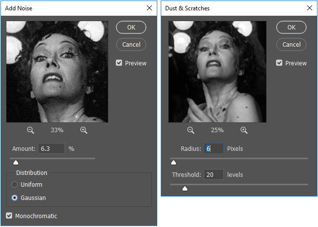
Beyond the scaling up of images we just discussed, you may find the need for further touch ups. I’ve found that using the “add noise,” “dust and scratches,” and the “reduce noise” filters after the enlargement can improve your finished image greatly. Experiment with these filters after going through the previous steps with an image of your choice to learn what works best.
Afterwards, I always recommend getting back to the 100% zoom setting and then manually fixing any blotchy areas or imperfections using cloning tools or the content aware fill features in Photoshop.
Tip #7 – Software Choice is Key
Most large format printers will accept files from Photoshop and Illustrator. Some will accept InDesign but more rarely. Very few will accept Corel products or third-party free apps like GIMP. And, I do not know of any respectable large format printers that will accept standard files from MS office software such as Word, PowerPoint, and so on. Therefore, it is important to have the right design software.
My first choice for large format design is always Adobe Illustrator. Although most designers feel more comfortable in Photoshop, Illustrator is really the most powerful tool for final assembly of your large format design.
You will of course use Photoshop for all preparations of raster images before placement into the Illustrator design, which makes Photoshop very important. But as an assembly tool with superior control of color, measurement, tone, and scale, no software compares to Illustrator, especially with the vector capabilities for shapes, illustrations, text, logos, and so on.
Sometimes you may need to only work in Photoshop if the entire job is raster based, and you must work at extreme dimensions and settings. That is OK too. The key is to know the graphic requirements of the printer and adapt accordingly. Which brings us to the next step.
Tip #8 – Read the Graphic Requirements
 Each large format job will have a specific list of graphic requirements for how the job should be prepared. Some printers will actually ask you to send “only PDF” files while others want original source files. But the key beyond the file format is the steps you need to take for proper file prep.
- Should the file be 100% scale (or can it)?
- Should the file be in RGB or CMYK mode?
- Will Pantones be an option and, if so, should you use coated or uncoated?
All large format presses are run in CMYK and do not conform to the usual offset printing rules. They can’t put in, say, Pantone 200C ink, and give you a match. Rather, prints are calibrated on a job-by-job basis in CMYK (or, on rare occasions, sometimes RGB) to try to get the color you indicated. Therefore, knowing how a printer wants the job is very important. So read the manual!
Other Tips:
- Less is more in large format design. Keep your designs simple. Something that is 20 ft wide, if very complex, will seem even more so. Simple images create stunning results.
- Keep a buffer of white/blank space in the design. Often you will find that display structures in large format have very odd constructions and shapes. Therefore, try not to span too many elements close to edges or over onto other elements of the design that have breaks. Rather, the more you keep “focus” elements of your design on the side/base they are intended, the better visual result you will have for marketing.
- One item in large format graphic design that makes all designers shudder is file size. If you are trying to create something so very large in the real world, you of course expect your file size on the computer to equal that frightening number. But there are tips to solve this, especially if working in Illustrator. Read this secondary article to learn how to reduce file sizes for large format design: https://www.fpportable.com/designing-large-format-graphics-in-illustrator.html
- Finally, you should never feel embarrassed as a designer to contact another designer for help. If any of the information you read here today, or any information you see on the graphic requirements pages/sheets for your current large format job don’t make sense, be sure to contact the company and ask questions! That is why these people are working in this industry. They WANT to make your graphic the most beautiful output possible. Designers that work in large format really care about results and always want to make the highest quality prints anyone has ever seen. So, if you just are not sure what to do, just contact the company you are working with. All professional large format design teams are eager to assist any level of designer as they enjoy the work and conversation. If you encounter someone who “doesn’t” treat you that way, you are not working with a professional team.
Large format graphic design is one of the most fun and enjoyable experiences I’ve ever had as a designer, and I’m happy it has become my main task day-to-day. Once you go big design, you don’t go back.
So get busy working on that large format design so “Yer Graphic’s Got Back!”
Becky would be happy.
Jacob Norris, FPPortable (Guest Post)
jacob@footprintexhibits.com
Jacob Norris is a project manager with Footprint Exhibits in Kent, WA. He has been designing graphics for over 24 years and has been working with large format for over 17 years.