Under the Heading of “Are You Friggin’ Kidding Me?!”
This week, we received a booth for storage, which is a service we offer through our Exhibits Northwest division. Like normal, we assembled it to determine if there were any issues. Now, here’s where it gets really interesting.
The display was built by ‘Blue” (and you know who I mean). Frankly, we have a great deal of respect for “Blue.” They have been market leaders for over 20 years in design, marketing, and product innovation. They know trade show marketing, and they know how to sell design. As a leader, you expect them to be trendsetters, not imitators. Certainly, you don’t expect them to copy iconic designs from other manufacturers. That wouldn’t make sense. They are “Blue,” and “Blue” doesn’t even acknowledge that there are other system manufacturers. But I digress.
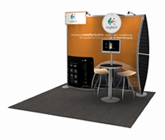
Over three years ago, Classic Exhibits introduced two distinctive display designs, both in response to the recession. The designs were the Magellan Miracle and Magellan MOR. These designs were intended to offer customers a sexy hybrid look, but at a more affordable price than upscale hybrids like Visionary Designs. There were fewer bells and whistles, but the Magellan kits included large format tension fabric graphics, curved metal, monitor, and counter options. These designs have been successful because they are engineered well, they assemble quickly, and they pack in portable roto-molded cases with die-cut foam packaging.
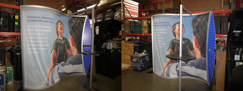
Too often, success breeds envy (or so we’re told) and the itch to imitate that success is often overpowering. Well, the display we assembled, as you can tell by the photo, bears an uncanny resemblance to the Magellan MOR VK-1078 and VK-2099.
Our first response was to be angry at “Blue” for copying our design. But, then we examined the display more closely and got really, really pissed off. It’s one thing to copy a design. It’s another to copy a design and butcher it. We felt sorry for their customer who went to “Blue” with a Classic rendering and the hope of a lightweight, easy-to-assemble, and attractive display . . . but got this.
At the risk of giving our competition a leg up, we’ll share with them what they got wrong.
- The Magellan MOR’s design is based on a smooth lightweight aluminum profile with a horizontal S-curve. We use the MODUL Z 45 extrusion. The metal should frame the graphic, not compete with it. The “Blue” design uses a large 50 mm grooved square profile, which is both physically and visually heavy. We hesitate to use the term unattractive. It’s not. Instead, think of it as an awkward teenager — no longer a cute child and not quite a confident adult.
- When you bend metal, the bending can create roller marks or cracks in the clear anodizing. Since you don’t want a customer who’s spending $8K or $16K to receive a less than perfect display, you have to re-anodize or powder-coat the metal. Yes, it’s more expensive, but it’s the right thing to do. Guess what didn’t happened to this display? Yep!
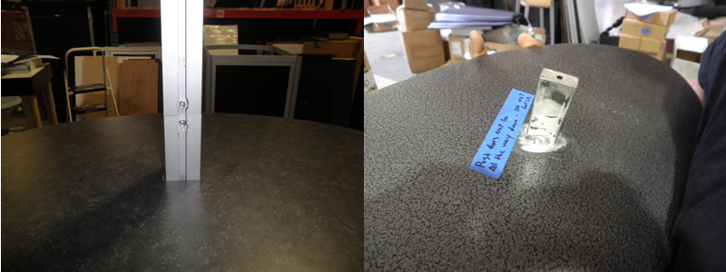
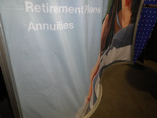 Portable displays are supposed to be easy-to-assemble, which is why we designed the Magellan (and the Sacagawea and Perfect 10) with knobs. While a few components may still require the hex key tool, such as counters or base plates, the goal is to make it easy and intuitive. We do. Our doppelganger twin did not.
- Here’s an easy one. Graphics should fit. There’s a reason they’re call “tension fabric graphics” not “shower curtain graphics.”
- Finally, make it easy for show labor to assemble and disassemble it. When they don’t understand how something should assemble, they use a sledgehammer when a screwdriver would be appropriate. Or in this case, they used a drill and a hammer again and again and again.
Next time, just ask us for assistance. While we won’t deny that we’re proud of our designs and our engineering, we’d much rather know that a customer got a display they’ll love for years and years, even if it’s not built by Classic Exhibits.
Happy Exhibiting!
–Mel White
http://www.linkedin.com/in/melmwhite
mel@classicexhibits.com
*********************************
Based in Portland, Oregon, Classic Exhibits Inc. designs and manufacturers portable, modular, and custom-hybrid exhibit solutions. Classic Exhibits products are represented by an extensive distributor network in North America and in select International markets. For more information, contact us at 866-652-2100.
Tags: Classic Exhibits, Exhibits Northwest, Magellan Portable Hybrid Displays, Perfect 10 Portable Hybrid Displays, Sacagawea Portable Hybrid Displays




Mel…I applaud your taking the high road, and not revealing the name of the less-than-honorable knock-off artist that stole HALF a great Classic design (sounds like they stole the “look”, but not the functionally intelligent engineering).
Wish I could pinpoint who the wannabe firm is. But “Blue” comes in so many shades. There’s “Process Blue”. I know there’s “Olympic Blue” (definitely not the case here; nothing ‘Olympic’ about this behavior). I used to enjoy “Sky Blue”, until perpetual over-forecasting turned this shade too stormy for even my sunny disposition.
I guess it just goes to show you: even a tough economy can make even Blue turn green…with envy.
Keep up the great work, my Classic friend(s)!
Mel,
I think we all know who “Blue” is. Frankly, it’s very surprising that this was even constructed, considering their current product line. But perhaps this is a sign of the times we are in economically. Anything to stay afloat?
In any case, it just proves what we already know. Classic Exhibits is the clear leader in portable hybrid exhibit design. Your displays “just work” out of the box (or superior foam jigged case).
However, one thing that will never be imitated is your customer service. From initial concept, through production, to final delivery, no other manufacturer can top the level of service that Classic provides.
Thanks for the entertaining post!
Thank you Jacob.